Thursday, July 28, 2016

[A&E] Chapter 4: Promotional Material

Norman Rockwell's "The Circus Barker"  (1916)
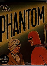
With the 2014 San Diego Comic Con quickly approaching, I was faced with the challenge of producing some promotional material that would have visually distinguished this Phantom series from all the others ever produced in the US by independent publishers.


THE PROMOTIONAL POSTER


In one of our initial phone calls, Hermes Press Publisher, Dan Herman, expressed the desire of seeing the cover of the first issue of our mini-series appear also on the front cover of “Previews.” (The monthly catalog published by Diamond Distribution)

The idea was both ambitious and expensive, considering the high fees charged by Diamond for their covers. Nonetheless, to appear on the cover of Previews would have added prestige to our project, increased its visibility and stimulated higher sales.

For me, this translated in the enormous pressure and responsibility to produce an impressing image that would have a strong impact on both retailers and readers and motivate them to give our series a chance.


I decided therefore that instead of creating an illustration for a comic book, I would approach my project as if we were making a movie and I was making a movie poster.


For my image I took inspiration from those epic movie posters of the 50s and 60s.  They usually had a shot of the hero -in action - in the foreground, surrounded by a collage of the best action scenes.  I was looking for something that would have given today’s readers the same sense of awe I had when, as a child, I first saw those posters.
I was inspired by the movie posters I saw when I was a kid.

I was also trying to make a strong statement that this was the same Phantom that generations of readers, worldwide, had grown to love. The Phantom that Lee Falk himself would have been proud to read.


I shared my ideas with Mr. Herman who, after presenting some initial concerns over the necessary extra budget agreed to use the image not just on the cover of Previews and as alternate cover of issue #1 but as the standard image of our press releases, banners, company’s websites, T-shirts, gadgets, etc.

In order to make my idea more appealing to my publisher and assuage his budgetary concers, I offered to do it for the same low cost of a regular cover (even though it would have taken A LOT more time and effort) and promised to gift him of the original art. (As I did, later)


Next I went on a hunt for all the elements that would make this poster illustration scream “The REAL Phantom is back!”


Lucky for me, I found in my home library a copy of “The Phantom Encyclopedia” (published by Frew in 2007) which was personally autographed for me by the late great Jim Sheperd. Within the pages of the encyclopedia I found inspiration and visual reference for many people and places which characterize The Phantom’s world, as envision by Lee Falk.
"The Phantom Encyclopedia" autographed by Jim Sheperd
All these elements came back to life in my collage: from The Whispering Groves to the Golden Beach of Keela Wee, to Phantom Peak; from Old Baldy the gorilla and Zima The Rogue Elephant to Stegy the Stegosaurus; from the Singh pirates’ ship to the  Sky Band’s airplanes, to the Bandar Warriors. All these elements and many more framed all our main characters: The Phantom, Hero, Devil, Diana and the twins, Guran, The Jungle Patrol and several others for a total of  25 different elements playing a visual  fanfare for “The Ghost Who Walks.”
Initial pencil sketch (above) and final inks

Grant Speed's statue of "The Masked Rider" found at Texas Tech University was the inspiration for my Phantom and Hero pose.

THE LOGO

Along with the promo poster I developed a new logo for the series. I strived for a “Retro” look with a classic comic book font and a circular “medallion” with The Phantom in his trademark heroic pose. The logo was later “streamlined” by Dan Herman. Nonetheless my version was used on the inside front cover of all six issues.
Color variations on the logo


COLORING MY WORLD

Mexican color artist Jesus Aburto was brought on board to color the poster and (potentially) the whole mini-series.

Jesus had gained a good reputation working for Marvel Comics (Punisher War Journal, Iron Man, X-Men, Kazar) and did a fantastic job coloring Howard Chaykin’s “Buck Rogers” mini-series for Hermes Press.

The process of coloring the poster took a little more than two weeks (much longer than expected) due to Mr. Aburto’s other commitments and the numerous color suggestions (and revisions) I had to provide, which took me away from working on the series’interior pages. (This resulted in further delays for me. When it was all said and done, the amount of time necessary to produce the poster divided by the time it took to complete it resulted in a wage of about $2.50/hour. That was the price I had to pay.)
The final result, however, was stunning.


Helping the colorist identify the order of planes (above) and one of several  color revisions sheets. ((Each number was explained in an accompanying email)
Background color variations
My proposed version of the poster. (It was changed later by the publisher)


Coming up Next: “For Those Who Came in Late…”  Re-imagining The Phantom’s origin story.

Thursday, July 21, 2016

[A&E] Chapter 3: Painting Myself in a Corner...


One of this mini series “Achilles’ heels” has certainly been its uneven and protracted publishing schedule.
Mistakes made by all (including me) from the very beginning, contributed to make this series chronically late.
These were mistakes made out of excessive enthusiasm and lots of good intentions, which, as we know, are the stones that pave the road to hell. Here’s what happened:

Following the initial negotiation stage, I had two urgent priorities pulling me in opposite directions. One was completing a story for Egmont I had already started. (8 pages had been completed which left me with pencil and inks for 24 interior pages and a cover to go) The other was producing as much promotional material (poster, covers and interior pages) as possible for this new project. By then, we were at the end of March.


This was the issue I was working on (for Egmont) at the time I accepted the assignment  from Hermes Press.

September 2014 was designated as the release date for the premiere issue of the Hermes mini series. A special presentation was also planned for the San Diego Comic Con, which was going to being held July 21-24. Given my circumstances, these dates were rather premature and would eventually reveal themselves as a gross mistake in judgment and planning. By the same token, these dates had been determined before I even came on board, and didn’t account for some intervening complications with Mr. Herman’s health situation, which delayed the choice of the series’ artist. (Me)

The mini-series was originally scheduled to debut in September 2014.

So, I found myself in a quandary. Had I given my full attention to the Egmont project, I could have completed it in three months. (Yes, I know, I am notoriously slow). This would have eaten all the time I needed to produce the bare minimum material for Hermes Press. Therefore I decided to complete 8 of the remaining 24 Egmont pages during the following month and ask my Swedish editors for an extension on my deadline. (They were not very happy about it, nonetheless they obliged)

Of course, those 8 pages ended up taking more than just one month, and I realized that I had painted myself in a corner even more. We were by then at the end of April, which left us two months before San Diego and five months before the release date of the first issue. In normal circumstances, by then we would have needed all the promotional material already sent to the distributor and the pencils of issue 1 fully done. Instead, we were (I was) still at the starting blocks.

Coming up next: Promotional Material.

Wednesday, July 20, 2016

BACK TO BLACK!


Here's a pencil commission I did over the blank cover of BLACK PANTHER #1.  It shows three stages of evolution of the character, from Kirby Panther ( a.k.a. "Happy Pants Panther") to my version ( which introduced the tribal motifs on the Panther's costume) to the "Civil War" version ( which adopted some of my designs on the costume)

For those of you who don't know, I worked on Black Panther  (Vol. 3) from 1999 to 2002 ( issues 13-49) and still hold the record for being the most prolific artist on this title. (Jack Kirby was the previous record holder)


Tuesday, July 12, 2016

[A&E] Chapter 2: “Your Mission, if You Decide to Accept it…”

Needless to say, that first phone call from Dan Herman was rather intriguing, notwithstanding the line was having the hiccups or dropping altogether several times. Because of that inconvenience, we decided to get back in touch over the next few days, both by phone and via emails. I was very interested in the project despite being booked solid with Egmont. Dan, on his end, was determined to find the right artist for the job, despite the serious health challenges he was facing at the time. We both decided to put our best foot forward and establish the premises of “The beginning of a beautiful friendship”


Anyway, these are the more salient points of our initial discussions and negotiations, which are also the reasons why I decided to accept what at first seemed a “Mission Impossible”


Here we go:


1) THE STORY WAS WRITTEN BY PETER DAVID!

Peter David’s fame and stature as a writer, by themselves, would  have been motivations enough for any respectable artist to jump enthusiastically on board.  In my case, this opportunity represented a welcomed reunion with “PAD” with whom I had previously worked on “Captain America” (Marvel) and “Justice League Task Force.” (DC) In 1988, PAD had also written the script of a Phantom mini-series for DC. (Read more about it, here.)
[I learned later that Peter had only written half of the series due to some substantial revisions  to the script which initially included another famous character from a different franchise.On top of that he would have been unable to help in the promotion of the project due to contractual obligations with another publisher… but we’ll save all these details for later.]

Sal Velluto and Peter David at the 2014 FanEx in Salt Lake City, Utah.

2) THE STORY WOULD STAR A “CLASSIC” PHANTOM!

Hermes Press had already established itself as publisher and estimator of classic Phantom stories: from the original newspaper strips to the legendary comic publications by Gold Key, Charlton, and King. When their license from King Features Syndicate was extended to publishing original material, it came natural to produce stories which would be faithful to Lee Falk’s  narrative and artistic approach. The story itself was set in the early 1940s and featured as co-protagonists Jimmy Wells and The Baroness, two characters straight out of the very first comic strips (“The Singh Brotherhood” and “The Sky Band”)
The choice of a “Classic” and “Canonical” Phantom was intentionally in contrast with more recent “Spurious” interpretations by other publishers.

The very first panel of the very first Phantom comic strip.

3) THE PROJECT WOULD REQUIRE A “CLASSIC” ARTIST!

Mr. Herman told me I wasn’t the first candidate to be considered for the job. There had been others who didn’t qualify for various reasons, including an unnamed artist who plainly stated: “I don’t like The Phantom!” It was during this protracted quest for the right artist that my friend Pete Klaus suggested my name to Dan and gave my qualifications as an established Phantom artist.  I felt confident I would fit the bill since I had made my living for several years already, drawing The Phantom in a classic style.


4) THE PRICE IS RIGHT... (Well, almost)

When it came to put the money where our mouth is, things became a little more challenging. (So what else is new?)  A flat fee to be divided in monthly installments was initially proposed to me.  If I divided the total amount by 120 interior pages and 6 covers (both penciled and inked) I would have ended up with considerably less money than I was making with Egmont. After some further negotiations, I signed a regular contract  (more in line with industry standards) where I would receive different fees for interior pages and covers and I would be paid 15 days after delivering the electronic files of each single cover and/or each batch of 10 interior pages., which would have guaranteed - in theory - a regular and continuous cash flow. ( Ultimately, things didn’t go exactly this way. More on this, later)
Unlike my contracts with other major publishers (Marvel, DC, Egmont) this contract didn’t include any royalties whatsoever. I was also accepting a considerable cut in pay compared to my Egmont fees, but I was willing to sacrifice some income in order to be back on the American market, working on the grandfather of modern super-heroes: “The Phantom; The Ghost Who Walks; The Man Who Cannot Die.”


Once we found ourselves on the same page, Dan and I signed over the dotted line. Now I was ready to Rock ‘n’ Roll!  About one month had passed since that first phone call.


Coming up next: "Painting Myself in a Corner."

Friday, July 8, 2016

[A&E] Chapter 1: “Guardian Angels”


"Pistol" Pete Klaus and Ed Rhoades (mustache) with Lee Falk and Sy Barry.
Back in 2007, soon after I started working on my first Phantom story for Egmont, I became acquainted with Ed Rhoades and “Pistol” Pete Klaus.

“For those who came in late” these two gentlemen happen to be two of the foremost Phantom historian, collectors and promoters. They were also the co-founders of the “Friends of the Phantom Society” which has sponsored numerous charitable initiatives along with a traditional annual luncheon at Sardi's Restaurant in New York with guests such as Lee Falk (who created The Phantom in 1936) and Sy Barry. (One The Phantom’s most iconic artists)

Ed and Pete quickly became my Guardian Angels. They educated me on The Phantom’s history, his heritage and what he represented for generations of fans worldwide.

Even after the untimely passing of Ed Rhoades (July 30, 2012) “Pistol Pete” kept the “Friends of The Phantom” going by keeping in touch with a lot of creators, editors, publishers and collectors from all over the world.

I was fortunate enough (and still am) to get periodical phone calls from Pete who encouraged me along the way, while sharing with me some rare reference material and even some Lee Falk and Sy Barry originals which are proudly displayed on my studio wall.

In one of these phone calls, ( in the later part of 2013) Pete mentioned that he had recommended my services to Dan Herman, the publisher of Hermes Press, a Pennsylvania company specializing in art books and classic comic book reprints.

Pete and Dan had been long time friends and had collaborated in the recovery of original material to be used in the reprints.

I told Pete that I would be willing to talk to Mr. Herman and I waited for his call for a few months, until that faithful day arrived, in February 2014.

Dan was calling me from his cell phone, on the way back home. That was the reason for the bad connection. “Saaal- bzzz- I heard good thingzz about you from our mutual friend Pete… Bzzzz…Anywayszz- zzzz- I have an offer for you, if you’re interested…”

Coming up, next: “Your mission, if you decide to accept it…”


Thursday, July 7, 2016

[A&E] Prologue: “Jungle Drums”


Many Phantom stories begin with the sound of the Jungle drums.

This story starts about the same way, except the sound of the jungle drums resembled more the ring of my phone.

“Hello –tzzzz- this is-zzzz- Daniel Herman, publisher of Hermes-zzz- Press- zzzzz…”

The connection was pretty bad and the caller on the other side was talking fast.

Nonetheless, I was able to make up the gist of the conversation, since I had already known, for months, this call would eventually come and why.

It was a quiet February afternoon of 2014 but the chain reaction that would bring me to this point, started seven years before, at the time I first started drawing The Phantom.

NEXT : “Guardian Angels”

[A&E] The Phantom: Danger in the Forbidden City


The Phantom: Danger in the Forbidden City  (Hard Cover and Trade Paperback) are now available for pre-order. (Click here to pre-order) The book collects the 6 issue mini series, written by Peter David and illustrated by yours truly. (With colors by Eugenio Mattozzi) Both editions will be presented at the San Diego Comic Con ( July 21-24, 2016)  

For the occasion, I would like to offer a creator’s perspective on the making of this critically acclaimed comic book miniseries. It’s a story  of a long journey through peaks of enthusiasm and valleys of disappointment. I decided to entitle it “The Agony and the Ecstasy” since it sounded more elegant than “Comics are Lke Sausages: It’s Better not to See Them Being Made.”

So, if you don’t mind eating sausage while on a journey through agony and ecstasy, claim aboard, fasten your seat belts and hang on tight, for the next few weeks. See you soon!

(Coming up next: “Jungle Drums”)

Wednesday, April 20, 2016

THE AGONY AND THE ECSTASY [A&E] : The making of The Phantom miniseries.

COMING UP SOON: A creator's perspective on the making of the critically acclaimed comic book miniseries. Stay tuned!

Tuesday, November 13, 2012

PANDEMIC!

Take a sneak-peek at the cover of my next issue of Fantomen/Fantomet.
What do you think?
Art:Sal Velluto; Colors:Eugenio Mattozzi

Wednesday, September 5, 2012

It's The End Of The World As We Know It (And I Feel Fine...)

Here's a sneak-peek of the December 2012 cover of FANTOMEN/ FANTOMET.
Can you guess what the story is about?
By the way, all the original artwork from this issue is available for sale, as a package.
If interested, please contact me.
Click on the image to enlarge.