
Here's the final product and an explanation of the painting process, written by the painter himself... (Drum roll)... Frew's cover artist extraordinaire... Antonio Lemos! (Applause)

The first one was to faithfully transfer the pen and ink image into a 300gsm (medium) Archer watercolor paper.
Once the image was tranfered, as accurately as possible, pencil lines were softened with an eraser to avoid graphite from mixing with the acrylic colors to be applied, and the whole page was kept immaculately clean, as to enhance the final presentation of the artwork.
As a color sketch had been done already notes were taken of the areas we wanted to highlight and we focus on achieving the Phantom's character exactly as envisaged in the illustration that was the basis for the painting.
I started by painting first the background, as usual; that gives me and idea of how strong the painting on the foreground should be. I applied a layer of transparent yellow under paint on it, but left the skull almost untouched. I wanted the white to be the white on the paper itself so as to get this nice effect of light bouncing on the board or the sheet as in this job.
I retouched it a bit after it dryied, an then proceeded to apply a dark green on the trees and bush surrounding the Cave. When they dryied I adjusted tones and values to convey the sense of distance and made the ones next to The Phantom a bit sharper and detailed.
The colours in the eyes and mouth of the skull had to be carefully chosen and applied. There was a risk there of making these features too prominent, thus detracting from the impact of the main figure.
I usually left the painting alone for several hours, to detach myself from its influence in my decisions about what to acentuate and what to subdue.
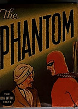
Then it was the turn for The Phantom himself; here I had to remember the colour of his uniform is more towards the light blues or purples. I gave him a soft purple under-painting all over except his face. That was kept as white as possible, with a light skin color with a touch of brown sienna, in keeping with his smiling face, and a masculine look.
The primary blue used for his uniform was applied in several layers, as the given ones dried. Sal warned me not to be "too dense", particularly with the red on his pants. The colour were all adjusted to give the paint an "homogenuos" look, and details were corrected before sending them to America as an electronic file.
And that's how we did it, folks!
Antonio
Coming up next: Part 5... with a little twist


Looks very nice and I got the guess right, I guessed Antonio - yay
ReplyDeleteApplause indeed! I look forward to seeing this cover published. Thanks for the details of the work process!
ReplyDeleteThanks to super-fans Jermayn and Andreas. Stay tuned for more developments... and surprises pertaining this cover.
ReplyDelete